Combining colours in outfits: a simple guide to the colour wheel
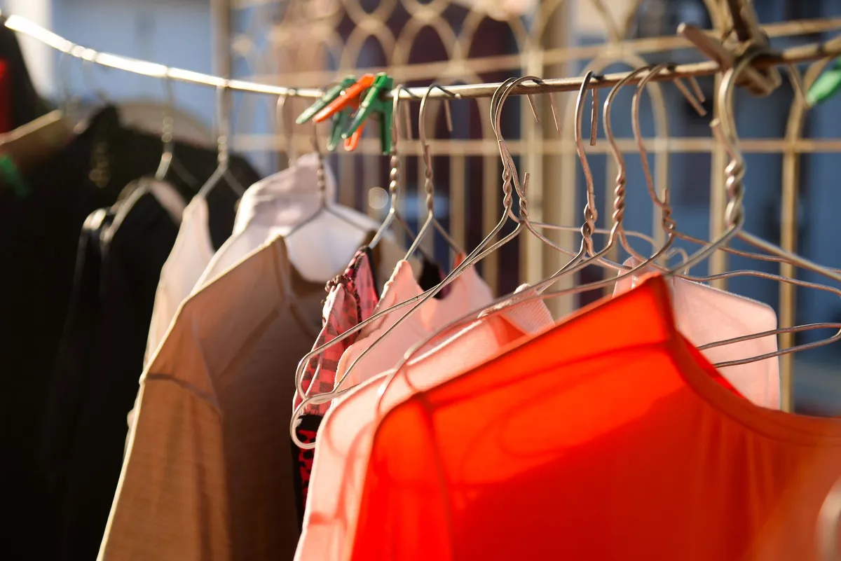
Many people stick to black, grey and denim not because they love them, but because they are unsure how to combine colours. Yet colour is one of the easiest ways to make outfits more interesting, and it does not require a new wardrobe. A few principles borrowed from the colour wheel are enough to combine what you already own with confidence.
The colour wheel in two minutes
The colour wheel arranges colours in a circle: red, orange, yellow, green, blue and violet, with all the shades in between. Three relationships on the wheel are useful for dressing.
| Relationship | Position on the wheel | Effect | Example |
|---|---|---|---|
| Tonal | Shades of one colour | Calm, elegant | Navy, cobalt and pale blue |
| Analogous | Neighbouring colours | Harmonious, soft | Blue and green, red and orange |
| Complementary | Opposite colours | High contrast, energetic | Blue and orange, red and green, purple and yellow |
Beyond the wheel, three more ideas help: neutrals, saturation and proportion.
Neutrals: the safe base
Neutrals are colours that go with almost everything: black, white, grey, navy, beige, camel, brown and, in practice, denim blue. An outfit made only of neutrals is always coherent. Adding colour to a neutral base is the easiest first step.
- Black and white are sharp and graphic. Our monochrome capsule wardrobe is built entirely on them.
- Navy is softer than black and pairs beautifully with white, camel and grey.
- Camel and beige are warm and look rich with white, cream, brown and navy.
The one-accent rule
If you are new to colour, keep the outfit neutral and add one colour. It might be a jumper, a bag, a scarf, shoes or even a lipstick. The accent draws the eye and makes a simple outfit look intentional.
A good trick is to repeat the accent once, in a smaller dose. A red jumper with a small red detail in a scarf or a bag looks more considered than a single isolated colour. Our guide to ways to tie a scarf shows how a printed scarf can bring a colour into the outfit.
Tonal dressing
Tonal dressing means wearing several shades of the same colour: cream, beige and camel, or pale blue, mid blue and navy. It looks elegant, lengthens the silhouette and is surprisingly easy. The key is to vary textures so the outfit does not look flat: a chunky knit with smooth trousers, a silky blouse with wool.
Analogous colours
Analogous colours sit next to each other on the wheel, so they share a common base. Blue with green, pink with red, orange with yellow. They create a harmonious, relaxed look. Choose one colour to dominate and use the other as support.
Complementary colours
Opposite colours on the wheel intensify each other. Blue and orange, for example, both look brighter together. The result can be striking, so a few tips help:
- Use the colours in unequal amounts, such as a blue outfit with an orange bag.
- Choose softer versions: navy with rust is gentler than electric blue with bright orange.
- Add a neutral to give the eye a rest.
Saturation and value
Two colours can be the same hue but feel very different. Saturation is how intense a colour is; value is how light or dark it is. A few guidelines:
- Combine colours of similar intensity for harmony: pastels with pastels, bright with bright, muted with muted.
- Mix light and dark values for contrast and structure: a pale top with dark trousers.
- Muted, greyed colours such as sage, dusty pink and slate are easy to combine and very wearable for everyday.
Proportions: the 60-30-10 idea
A popular guideline from interior design works well for outfits too: around 60 per cent of a main colour, 30 per cent of a secondary colour and 10 per cent of an accent. In practice, that might be navy trousers and coat, a cream jumper and a touch of red in the bag. It is a guide, not a rule, but it helps when an outfit feels unbalanced.
Easy combinations to try
- Navy + white + red accent
- Camel + cream + chocolate brown
- Grey + pale pink + white
- Olive green + rust + denim
- Black + white + cobalt blue
- Burgundy + navy + grey
- Denim + mustard + white
Denim acts as a neutral in almost every combination. See our guide to wearing one denim shirt, five outfits for examples.
Colour near your face
Colours worn close to your face affect how your skin looks. Some shades make you look fresh, others tired. Try holding tops of different colours up to your face in daylight and see which ones brighten your complexion. Keep those for tops and scarves, and wear trickier colours further away, in trousers, skirts or shoes.
Metals count too
Jewellery and hardware also bring colour. Gold tones feel warm, silver tones cool. Match them to the overall mood of the outfit, or mix them deliberately, as discussed in our article on layering gold jewellery. Colour, after all, is not about rules but about practice: try one new combination a week, and your wardrobe will suddenly seem much bigger.
This article may contain partner links. They never influence what we write.